Monte Carlo Portfolio Simulation - What I Built, What I Learned, and What the Numbers Mean
A behind-the-scenes look at building a probability forecasting tool from scratch in Python.
The question that started it
Most financial projections give you one number: “your $100k will grow to $196k over 10 years at 7% annually.” That's technically true as an average. But it hides everything interesting, it doesn't tell you the range of outcomes, how likely you are to hit a specific goal, or what a bad decade looks like versus a good one. The question I wanted to answer: given real uncertainty in returns, what's the actual probability of reaching a target value? Not a point estimate - a distribution. That question led to this project.
What Monte Carlo simulation actually does
The core idea is simple. Instead of assuming returns are fixed, you draw them at random from a distribution, one that reflects both the expected return (the average) and the volatility (the spread). You do that for every year of a 10-year horizon, compound them, and see where the portfolio lands. Then you do it again. And again. Ten thousand times.
Each run is one possible future. The collection of 10,000 endings is a probability distribution, and from that distribution, you can extract everything: the probability of hitting your target, the range of realistic outcomes, and where the median sits relative to the mean.
The most important technical decision: lognormal returns
Early in the build, I used a simple normal distribution for annual returns. It's intuitive, returns cluster around the mean with some spread, and it works well enough for a single year. But normal distributions have a flaw for multi-year compounding: they can produce returns below -100%, meaning a portfolio value that goes negative. That's mathematically impossible.
The fix is the lognormal model. Instead of drawing a return from a normal distribution, you draw the exponent from a normal distribution, then raise e to that power to get the growth factor. Since e^x is always positive regardless of x, the growth factor is always positive, value can never go below zero. That structural guarantee is the right model for asset prices, and it's the standard assumption in quantitative finance. A small code change. A big conceptual difference.
What the numbers showed
Starting conditions: $100,000 initial value, 7% expected annual return, 15% volatility, 10-year horizon, target of $200,000. After 10,000 simulations:
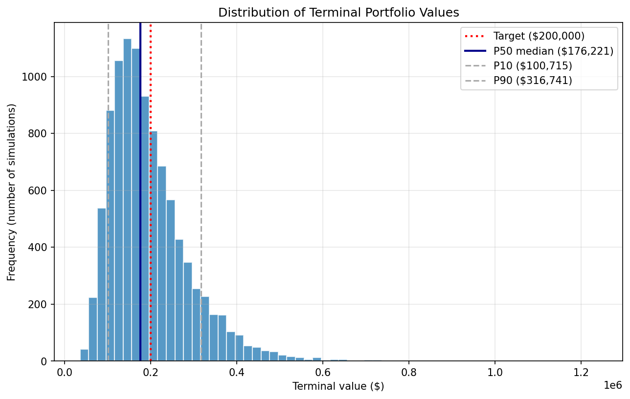
Probability of reaching $200k - 39.5%
P10 (pessimistic) - $102k
P50 (median) - $177k
P90 (optimistic) - $317k
Mean - $197k
The gap between the mean ($197k) and the median ($177k) is the most telling number in the table. It's not a rounding artifact, it's the signature of right-skewed compounding. A small number of high-growth paths stretch far to the right (some simulations reached $600k or more), pulling the average up. But most outcomes cluster lower. The typical outcome is below the average, which is exactly what the lognormal distribution predicts. If you'd used the mean as your planning number, you'd overestimate how likely you are to hit it.
The probability cone
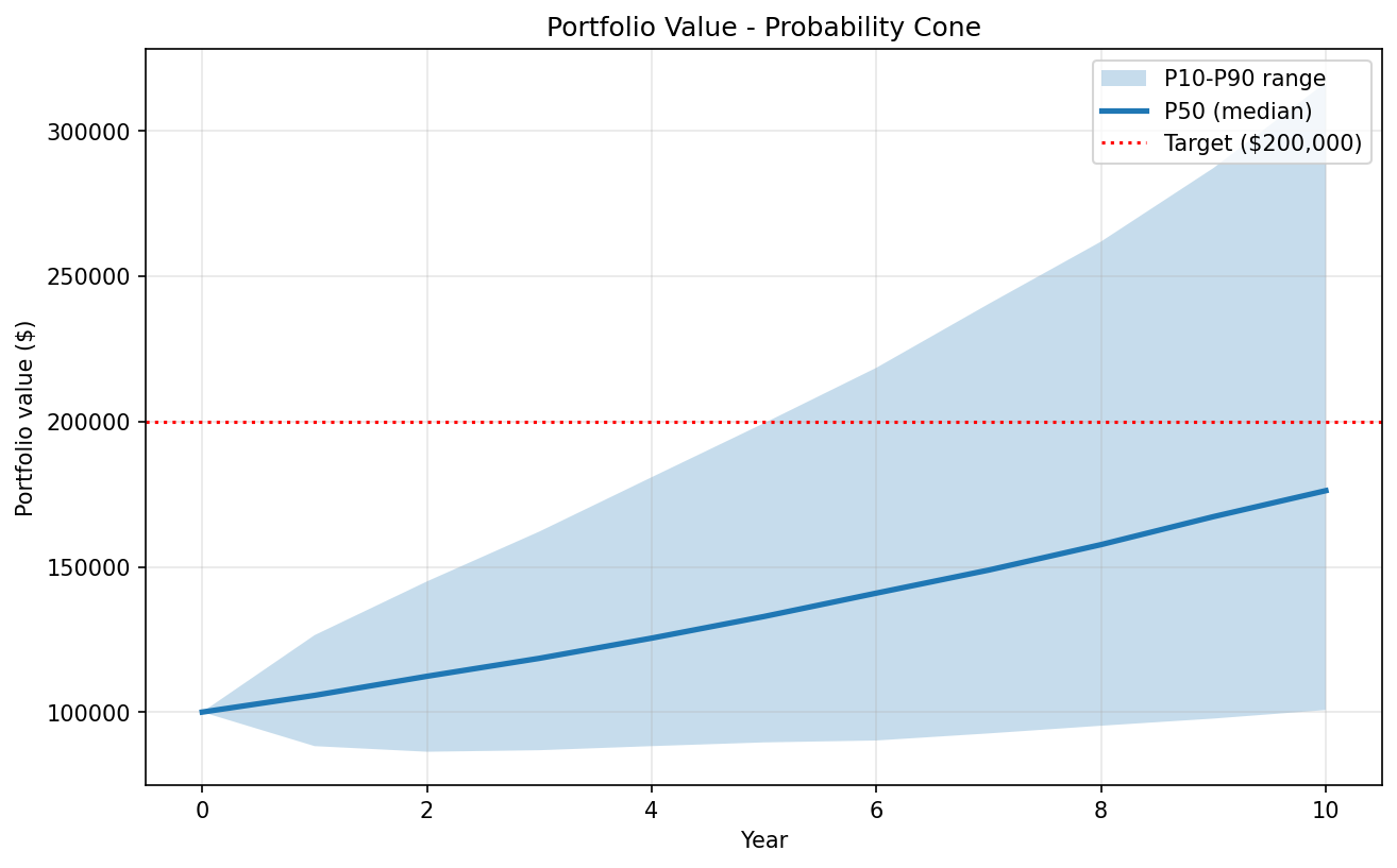
The cone chart is where the simulation becomes visual. At year 0, every path starts at $100k, no spread. As years accumulate, randomness compounds, and the gap between the P10 and P90 paths widens. By year 10, the P10 path is roughly where you started ($102k) while the P90 path has more than tripled ($317k).
The median line climbs to $177k, but crosses below the $200k target line, which is the visual explanation for why the probability is under 50%. More than half of simulated futures don't reach the goal. The cone makes that concrete in a way a table can't.
What the deliverable looks like
Beyond the notebook, the project produces a structured Excel workbook with three sheets: a summary of assumptions (in blue, financial-modeling convention) and results, the year-by-year cone data (P10/P50/P90 at each year), and an embedded charts sheet with both visualizations. A methodology note documents the simulation design and assumptions.
The same framework generalizes to any "probability of reaching a threshold under uncertainty" question, valuation milestones, exit hurdles, retirement targets, revenue goals.
What I took away from building it
Two things stayed with me. First, the lognormal lesson: the model has to reflect how money actually works, not just be mathematically convenient. Getting that wrong produces outputs that look reasonable but are subtly broken. Second, the median vs mean insight: distributions tell a different story than averages, and that story is usually the more honest one. Uncertainty isn't a reason to avoid quantifying the future. It's exactly the reason to.
GitHub repo: https://github.com/naumenko-analytics/monte-carlo-simulation
